Land, Sea and Air
Originally Posted September 25, 2009
Time for another update I think, been a while actually (or at least it feels like that!). So over the past couple of weeks I’ve been working on various bits and pieces for the environment, firstly making rock clusters which are scattered around the bay, such as the path from the lighthouse to the beach and the hermit’s cave. I’m still in two minds about using models for rocks like this however as I’m not a big fan of the vertex lighting, even with all the advances of the OB’s per-vertex lighting and self shadowing. I find that the lighting is often inconsistent with the lightmapped geometry, so I’m considering changing them over (or at least partially) to displacements and seeing how the performance compares.
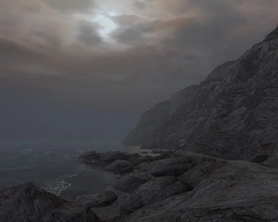
Another thing I worked on, and something that had been bugging me since the project started, was the problem of creating a realistic ocean with Valves pond water. After unsuccessfully trying various complex solutions I finally decided to go back to basics and tried a simple scrolling TwoTexture, with some carefully crafted textures, applied on a brush 1 unit above the water. Initial results were very promising but one of the major problems I had over such a large area was inevitable tilling. I countered this by converting the brush into a displacement where I could skew and shape the texture to avoid any ugly tilling and better match the contours of the shoreline. The result was quite satisfying and overall not too expensive, and I can optimise it further later on if necessary:
Something may also notice in these shots is the new lighting and sky. I saw some concerned comments that it was previously too bright, and although it was only placeholder in previous shots, I had to agree it was not in fitting with DE’s atmosphere at all. As you can see I darkened the sky and lighting considerably and tried to select a palette which better suited a darker and mysterious atmosphere.
Finally I got some help from coder, Jack Morgan, who helped fix a few annoyances such as footstep sounds and crouch speed as well as one other feature allowing me to have more control over what can be done with detail sprites; Basically I’ve been hoping Valve would fix the problem detail models (instead of sprites) killing fps in the engine since I first started mapping but unfortunately it seems like the engine is just not built to handle it. Detail models offer a very simple way of adding variation to large surfaces such as the beaches in DE without having to place hundreds of models or decals individually and only need to be seen when the player is in close proximity. The solution Jack and I came up with was to instead use sprites that are parallel to the ground which then create the effect of texture variation and detail. There results were surprisingly good and best of all cheap as chips!
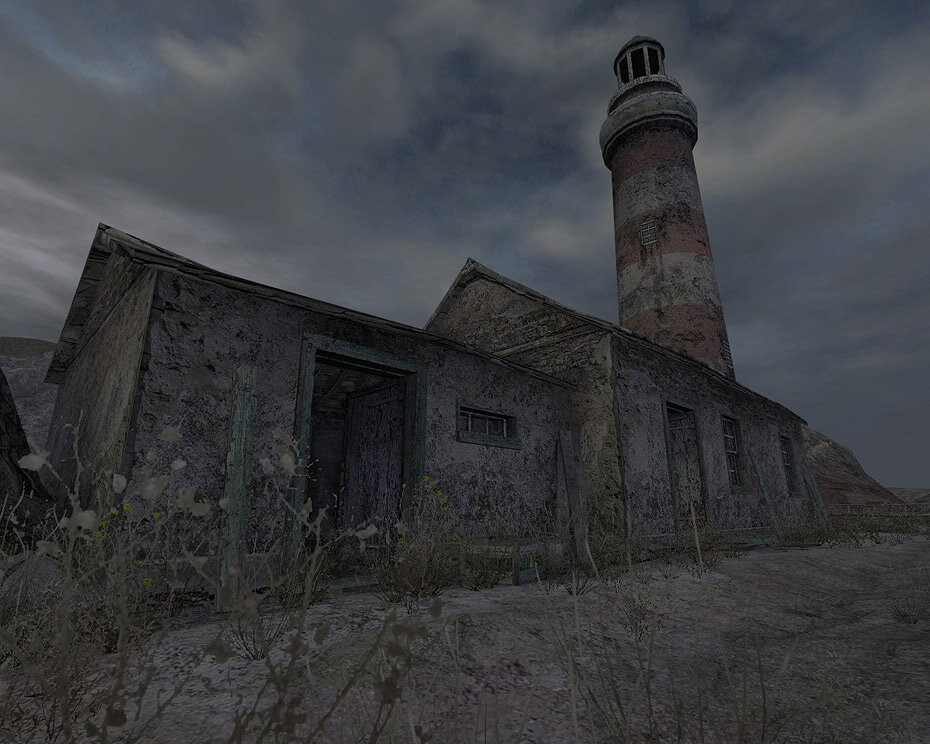
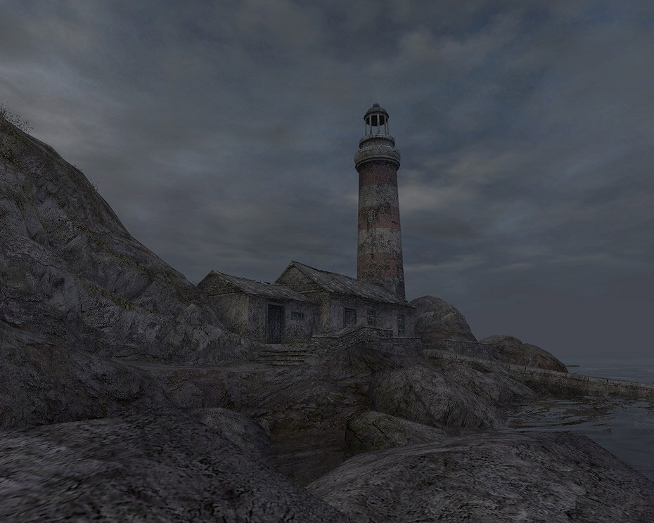
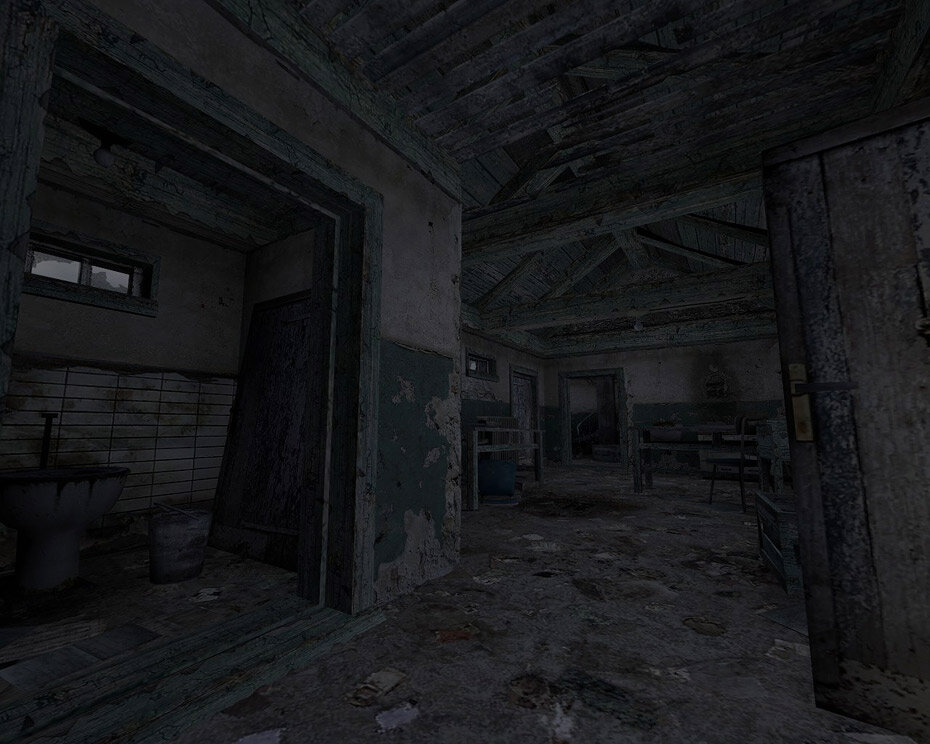
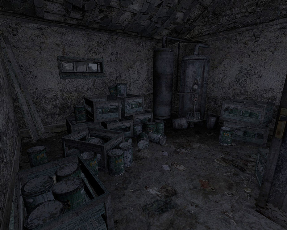
After all the small bits and pieces were sorted I decided it was time to get focused. My plan is to focus on one area’s art every week and try to get them at a level where all they need is polish. This week I have been focusing on the Lighthouse area at the beginning of the first level. Originally it was just a small stone house that didn’t make much sense in that location. I decided a lighthouse would be more fitting, and with the inspiration of Ben Andrew’s concept art I built what you can see below:
This was pretty taxing to be honest, with lots of small props being required for the interior which can be very time consuming in Source. Although it still needs a lot of polish, overall I’m pleased with the results and next week I shall start on another area.
Finally I made up a short video showcasing the sea and sky in action so that you can more clearly see it to full affect, Enjoy!

